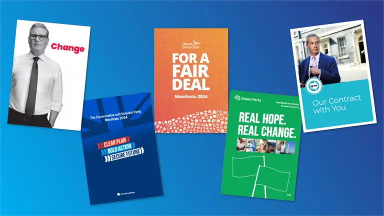
It’s been a whirlwind week of manifesto drops! Our Public Affairs colleagues have published detailed PLMR Insights notes on the Labour, Conservative, Liberal Democrat manifestos – with further detail in our dedicated weekly GE Insights mail outs (sign up here).
But our creatives have had a slightly different focus, critiquing names, designs, accessibility features and the parties’ general launch communications.
Which led us to ask: who designed it best? Read on for a series of thoughts from our Senior Creative, Senior Designer, Senior Digital Content Producer and our Group Director of Digital.
Labour Party
Change
Launch Date: 13 June
“Keir Starmer, front and (almost) centre. The direct antithesis of the Conservative Party’s faceless designs. The choice to use one word as a title instead of a phrase is also bold and reflects what they believe the public is seeking most: Change.”
“Probably the most accessible styling of the lot, with clean white backgrounds and high-contrast text with pop colours used to call attention. Really elegant use of type and colour.”
“Easily the boldest and most iconic cover of this year’s election. The obvious similarities with Blair’s more presidential campaign assets are noticeable, but the tone is strikingly different. Whereas Blair’s campaign imagery often evoked a hopefully optimism, Starmer’s cover appears more stark, stoic and business-like – this fits the more dour tone of a party, which has centred its messaging around following strict fiscal rules and prudent management to turn around the country’s fortunes.”
“The most user-friendly navigation of the manifestos, reflecting the styling of the Mayor of London’s Digital Manifesto (which just so happens to have been designed and built by our talented digital creatives). Accessible versions are quite easy to find and access!”
“The longest document, but dynamically designed and therefore not too taxing to skim through.”
Conservative Party
Clear Plan, Bold Action, Secure Future
Launch date: 11 June
“The Conservative branding is something of an afterthought, and I wonder if the Party will be looking to rebrand themselves after potential big losses at this election. The main manifesto logo reflects small elements of the “Ready for Rishi” logo, perhaps the closest thing you’ll find to a visual reference to the Party Leader…”
“The Conservative Manifesto cover appears to be a collection of campaign assets from previous elections – the blue-wash Union Flag of the Cameron years, the light blue highlighted text of Boris’s branding and the sober, darker tones of May’s Manifesto. Without the Prime Ministerial candidate on the cover, it strikes a strong contrast with Labour, but is ultimately forgettable for its lack of a singular memorable focus.”
“Play some Elgar and relish in the patriotic tome that is the Conservative Manifesto, featuring 10 pages taken up entirely by the Union Flag. I enjoy the bold colour palette and clear structure, but points are deducted as accessibility (woke) appears to be an afterthought. The occasional page features only a splatter of text in the top corner due to formatting errors. 3/5 stars.”
“Apologetically conservative in branding while leaderless in photography.”
“There is a surprising lack of consideration for the user experience. The calls-to-action for the main four pulled-out points jump the user down to a flipbook, but not to the specific content in reference, so you still have to flick through the pages to find the information.”
“The heavy sectioning with variation between centred and left-aligned text makes page scanning quite taxing. Unlike others, they have not provided accessible versions as downloads. Accessibility should not be an afterthought!”
“A very editorial approach compared to others, with accessibility suffering as a result. Fonts and graphics sit somewhere between the modern and the traditional – like the Party it seems to be somewhat having an identity crisis. It reminds me somewhat of old Nationwide branding.”
“They’ve gone big on the flag! Trying to appeal to Reform voters?”
Liberal Democrat Party
For a Fair Deal
Launch date: 10 June
“Unlike Ed Davey’s weird and wonderful campaign activities the manifesto lacks pizzaz, perhaps intentionally, as their approach seems to be to combine the gimmicks with a degree of seriousness when it comes to policy.”
“The colour scheme moves away from the traditional Lib Dem yellow, introducing a soft, silky gradient. This may be an attempt to appeal to a more youthful audience, with a modern feel.”
“In an election where many voters have looked for a serious alternative to the Conservative Party, the Liberal Democrats “memer”-in-chief Ed Davey’s antics have proved divisive, although inarguably attention-grabbing. When it comes to manifesto design, however, the Lib Dems have struck a tone that is reassuringly reserved. Some will be disappointed that the 117 pages feature no images of Ed Davey in a dingy, but the design is sleek and the warm imagery of Davey is a nice touch. 4/5 stars.”
“The Lib Dem’s have gone for a strikingly modern style with a colour gradient reminiscent of modern web design (and perhaps Instagram’s branding in particular). However, the somewhat random icons at the bottom of the page feel like an afterthought and ultimately convey very little. Ultimately, although bolder and simpler than the Conservatives, I worry this design won’t be remembered in the years to come and may age poorly given its hyper-modern aesthetic.”
“The design is clear and no-nonsense with a helpful search bar. It was an interesting choice to use pop up boxes as these can be a pain on mobile but do help make content more digestible.”
“Whilst they haven’t paid particular attention to the typography the text is overall easy-to-read.”
Green Party
Real Hope Real Change
Launch date: 12 June
“The Greens have gone for a block colour and vector-based design quite reminiscent of the 2017 and 2019 Labour manifestos from the Corbyn years. The “green flag” is an interesting choice, moving away from images of environmentalism and more towards a general sense of campaigning – the flag itself is clearly a nod to the left’s red flag, showing the political direction of the party as a home for leftwing activists who have left Labour under Starmer.”
“A strong call to action at the end: Vote Green!”
“Accessible versions are not blatantly obvious, but also not difficult to find! Navigation is pleasant with lots of imagery, but the design is not ground-breaking.”
“Another surprisingly editorial approach, like the Conservatives, although with more impact. Unfortunately, the pages are extremely cluttered with walls of text and logos on every page – slight overkill.”
Reform UK
Our Contract with You
Launch date: 18 June
“Reform UK is the only party naming their main policy document a “Contract” instead of a manifesto. This unique choice of language fits neatly with their approach to position themselves as entirely different to the main two parties, which the general public are so disillusioned with.”
“Reform have made the interesting choice of terming their manifesto a “Contract”, with Farage taking centre stage. As Farage has said the title change is about building a relationship of trust with their new following, in contrast to what he sees as the “broken promises” present in the manifestos of the major parties. Farage is the star of the show, and so he’s naturally front and centre – the image choice of Nigel in front of Number 10, whilst also with his back to the building, is masterful – it shows a party aiming for power, while also conveying an “outsider energy” and a natural distain for the political mainstream that resonates with their membership.”
“It is no accident that on the cover of Reform’s contract, Nigel Farage resembles a Guy Ritchie protagonist pulling a pistol from their jacket before dispatching a rival. In imagery throughout the contract, Farage is not so much an Action Man, but certainly a man of action. Points were deducted as the design is often haphazard and accessibility is an issue. 3/5 stars.”
“Similar to the Conservatives, I have not been able to quickly locate any accessible versions as downloads. There’s also not a dedicated page for the manifesto, unless you count this one, which is just an unnecessary extra layer before the PDF.”
“There is evidence of a draft version of the contract which has quite serious display and accessibility issues. On the contrary, the main contract has resolved these issues, has some good imagery and attention-grabbing calls-to-action. They have, interestingly, not gone in as big on the flags as the Conservatives! Farage features heavily, photographed in a candid, almost everyman manner.”


