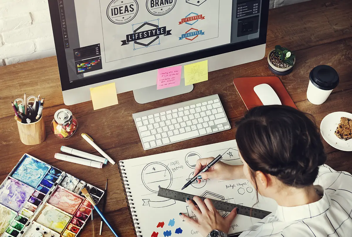

As a designer with years of industry experience, I have conducted many rebrands in my career across a range of organisations and sectors. And whilst every client is different – with its own set of unique values, audiences and challenges – there are a number of lessons I’ve learned which can apply to any organisation looking to rebrand.
When your organisation is approaching a rebrand, there are a few different routes you might like to explore with your logo. In this blog, I highlight the potential pitfalls of those routes, and my advice on how to stand out.
WORDMARK OR LETTERMARK LOGOS
Wordmark examples: Google, IKEA, Disney
Lettermark examples: BBC, NHS, McDonald’s (M)
Pitfall:
“Pick a nice font and be done with it”
There is a finite number of fonts out there, and even fewer when you start to consider legibility, flexibility and appeal. Odds are, someone in your field will use the same font in their branding. You want to stand out, don’t you?
My advice:
Consider a bespoke font, either created entirely from scratch specifically for your brand, or adapted from an existing font in a way that makes it stand out. Bespoke letterforms are very on-trend for 2023.
Pitfall:
“Let’s say everything we do in our strapline”
A logo and strapline should be a simplified way of communicating who you are. It reinforces your good name, work and reputation in a single recognisable and memorable visual. Shoehorning lots of buzzwords in could put people off or be ignored entirely.
My advice:
You want to hook people in with an enticing logo and then tell them your life story. Keep your strapline short, sweet and catchy. Make sure both your strapline and your logo are easy to read in the various possible sizes it will appear (think social media profile picture on a mobile phone). If your name is very long, consider initialising it to improve recall (but not if you are a brand-new business, as your target audience will need to get to know who you are first)!
PICTORIAL OR ABSTRACT LOGOS
Pictorial examples: Apple, Twitter, Nike
Abstract examples: Pepsi, BP
Pitfall:
“Won’t a simple circle do?”
Once again, there is a question of uniqueness. What’s to stop your competitor doing the exact same thing? They could damage your reputation by association, or piggy-back off a reputation you’ve worked hard to build.
My advice:
Create your own unique icon that evokes the tone you are hoping to associate with your business. This also helps reduce the need for wording, as the icon does some of the heavy lifting.
Pitfall:
“We want no words, just an icon. Like the Nike tick”
An icon won’t be enough on its own to encourage the recall you need from your logo unless you are a well-established brand.
My advice:
Pair it with lettering that harmonises well. Together with positive client experiences and good marketing, people will associate your unique icon with you in the desired way. The wording can be shed slowly in certain situations as you become more established.
EMBLEMATIC LOGOS
Emblematic examples: VW, Warner Bros
Pitfall:
“I want a pixel perfect rendering of my horse/face/office building”
High detail, complex renderings are often wasted as logos due to their nature. Logos are frequently used at small sizes causing detail to be lost. The extra detail usually means extra colour and therefore extra printing cost. And finally, there is a question of whether the horse/face/building alone will be contextually relevant to your prospective clients, or whether it just means something to certain people in the business.
My advice:
Emblematic logos have a historic feel, so if you are a business wishing to be treated as modern or cutting edge, I would avoid this approach entirely. But if you would like an emblem, I recommend creating a simplified graphic version in tandem. This will work better at smaller sizes and on mobile.
FINAL THOUGHTS
An experienced graphic designer can help you successfully navigate the common pitfalls of a rebrand. At PLMR, we analyse your industry, your USP and your value proposition to deliver a coherent logo and visual identity. This reinforces your good reputation and gives you an attractive visual platform on which to build a successful organisation.
Learn more about our graphic design services, or get in touch today to start your rebrand journey.