The ever changing COVID-19 press conference podium graphics
PLMR’s Graphic Designer, Rachel Brandon looks at how the COVID-19 messaging has been portrayed and changed.
Since 16 March 2020, the Government has been holding daily press conferences to address the ongoing development of the Coronavirus pandemic. As the effects of the virus become more serious and dangerous, the Government has adapted its messaging and graphics, all within a few weeks. The following is an analysis of the changing graphics and the reasons behind it.
Pre lockdown announcement
16 – 19 March

The nhs.uk/coronavirus link is displayed on a white background with NHS blue text, very simple and basic branding with the sole purpose of directing people to the NHS health guidance.
20 – 22 March

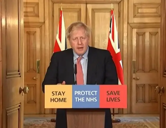
As Boris Johnson announces that pubs and restaurants are to shut, the messaging on the podiums has changed, the now infamous ‘Stay at Home, Protect the NHS, Save Lives’ slogan makes its first appearance, in the same simple branding as the previous NHS link.
23 March
Boris Johnson announces that the UK is going into lockdown. No graphics are shown in this setting, the Prime Minister sat at his desk, as the tone is much more intimate and serious.
Post lockdown
24 March

The ‘Stay at Home, Protect the NHS, Save Lives’ messaging is displayed in new branding. A yellow, blue and red colour scheme corresponding to each part of the messaging stands out much more compared to pre lockdown graphics. This grabs our attention and stresses the urgency of the situation. Although maybe not intentional, the use of three colours that are the party colours for the Conservatives, Labour and the Liberal Democrats shows a united front, which may be comforting to some.
The graphics on this day are vertically aligned, making them very small on the horizontal podium and illegible if captured too far away. This brings us on to the next round of graphics.
25 – 29 March

The graphics have now been changed to horizontal alignment, making them far more impactful and fitting to the importance of the messaging.
30 March – 1 April

In the next set of press conferences, the podium graphics have had a dramatic change. The three-colour block design has been changed to an all yellow background, with diagonal red lines etched around the edge, reminiscent of hazard symbols. The messaging is accompanied by bright red arrows, easing the flow of text. The podium now looks like a warning sign, showing just how serious and dangerous the pandemic has become over a short amount of time. It is even more stark when you compare to the very first set of graphics only a few weeks prior.
Is this the only reason the graphics were updated so dramatically? After the press conference went live, a tweet from the Colour Blind Awareness Organisation thanked the Government for updating the graphics to be accessible to colour blind people.

“Well done @10DowningStreet for changing the podium graphics so they are now accessible to the UK’s 3 million people who are colour blind! Please keep checking all Govt info, for #coronavirus especially, is accessible. Thanks.”
Upon further research, there were a lot of comments online asking the Government to update their graphics, including the graphs used in the press conferences, to be adapted to be accessible for colour blind people, so this may have been a direct response from the Government regarding this issue, while also making the graphics bolder and amplifying the danger aspect at the same time.
2 April – Today

The red lines on the border of the podium graphics have been made thicker, increasing the visibility of the ‘hazard’ elements of the graphic.
From a design perspective, one of the main things to take away from this is that refinement is key. The team behind the creation of these graphics were working with an unpredictable brief that was updating daily, so there really is little time to perfect and tailor these graphics to their maximum potential. Now that messaging and guidelines are strictly in place, I imagine they will be sticking to the graphics they are using at present for as long as possible, but no one can predict what the next chapter in this ongoing pandemic will be, and how the government will need to present its message.