This week, the Conservative Party have put out a series of tweets as part of their #GetBrexitDone campaign, featuring an array of garish, shouty and poorly-designed infographics – it’s truly a sight to be seen!
We’ve all had enough of Labour’s dither and delay, MPs must vote to #GetBrexitDone on October 31. pic.twitter.com/2EaMwcG0xF
— Conservatives (@Conservatives) October 22, 2019
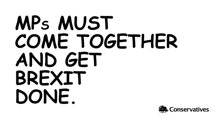
However, one graphic in particular caught the ill-prepared eye of many and sent us all into meltdown. There it was, in all its glory, the infamous Comic Sans. A designer’s worst enemy, unapologetically displayed to the Conservative Party’s 400,000 Twitter followers – how could it be?!
Now is the time for MPs to back the new deal and get Brexit done.#GetBrexitDone pic.twitter.com/JuqaOVdlMC
— Conservatives (@Conservatives) October 22, 2019
Now, you don’t have to be a design guru to know that Comic Sans is objectively a bad font, it just simply doesn’t work in any professional context.
Why then have Britain’s governing party purposely produced such artistic atrocities? One word – traction. Likes, retweets, replies. While the Comic Sans infographic generated a similar amount of likes and retweets to other infographics, the replies have more than doubled, totalling a whopping 2,200 currently. More replies mean more people talking about it, which spreads the message further and gains more coverage (including me writing this very blog about it!). On the face of it, this simple campaign has worked – cleverly leveraging traditional and social media to amplify their campaign slogan.
But what exactly are people talking about? The message or the medium? Are we discussing the political agenda the graphics promote, or the poorly (deliberately chosen) design? I fear it’s only the latter…
In short, let the message speak for itself and let good design help it to resonate with your audience – that’s the only real way to get your point across online.
Unfortunately, I expect we have many more drop shadows and rainbow gradients to come…


