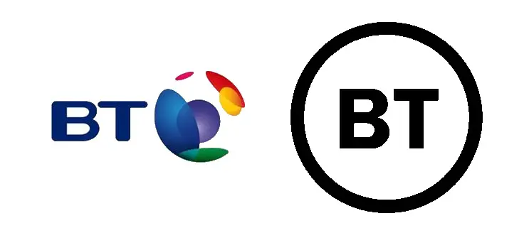
The unveiling of the new BT logo has created quite a storm online, many commenting that it’s too simple, one dimensional and looks like it was whipped up in 2 minutes rather than something that has been in development since 2016. While I largely agree with these points, as a designer it is also important to look at these things in the bigger picture. Your brand identity is not solely your logo. The logo is there to enhance the brand and compliment other aspects of it, whether that be marketing materials, online presence or large format prints. So yes, the logo looks like it could be an extension of the Independent Group’s ‘TIG’ logo (don’t get me started!), but it needs to be shown in context with BT’s full brand identity to achieve its maximum impact.
On a separate note, it also demonstrates BT’s power as a mega company; they simply can rebrand to a basic logo, because their brand itself is the one doing the talking, and they have a large customer base. Building up a brand identity can take years and years of hard work and patience – and this is an important thing to keep in mind if you are looking for a new logo. While a better logo can enhance your brand identity and values, it is not the only thing that will help with growth and recognition.


