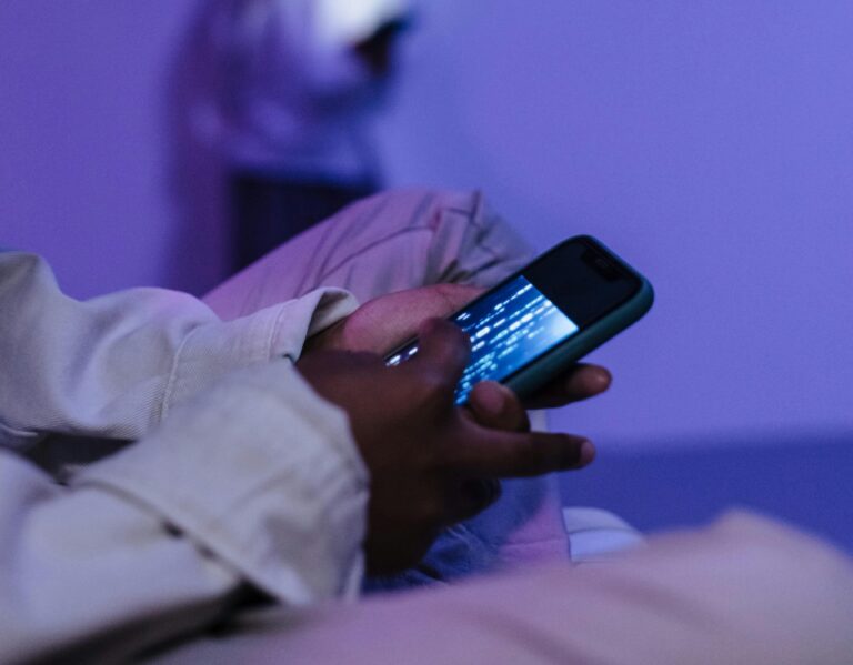
Ultra Violet – the Pantone Colour of the Year 2018. A colour portraying forward thinking, modernity, energy and the everlasting mystery of what our future holds. In the era of AI and technology becoming intertwined with our everyday lives more and more, it’s no wonder that the colour associated with it has become so popular across the design world.
A design element I have noticed often coupled with Ultra Violet is a gradient effect. A deep purple swooping and merging into a pastel counterpart, whether that be pink, blue or even green. This could be perceived as a direct visual representation of a galaxy night sky; however, is there deeper meaning behind the reoccurrence of an old trend?
When one thinks of gradients in design, they are often classed as tacky and overpowering. There is something strangely nostalgic about them, an element used to jazz up a Powerpoint presentation, or a colour option in WordArt. So why are they now increasing in popularity, and more importantly, look better than before? A gradient represents movement, a flow in colour from one end of the spectrum to another, on a static and traditional medium. It creates a 3D element, as the curve of the gradient can be cast in different angles and shapes depending on the object. A 3D object has an expectation to move, it appears as though it has life and weight to it, and in particular with gradients, they are beautifully rhythmic and relaxing.
The life-like look these elements create could be a reason for a sudden surge in popularity for them. We are surrounded by modern mediums of design – animation, motion graphics, video – as the screen takes over traditional print based mediums more and more each day. Are we using qualities of a 3D object in traditional mediums to satisfy our need for movement? Still images aren’t enough anymore, we need the instant satisfaction of a beginning and end, a story to tell.
Whether it’s embracing advancement in technologies or an attempt at rejecting it altogether, there’s no denying that that futuristic elements such as the colour of Ultra Violet and 3D-esque gradients are a direct result of society going more digital. When working on a re-brand project for our Digital Team at PLMR, these are the exact elements that I thought were key to include. We offer an array of digital services including Social Media Management, Content Creation, Video Production and Graphic & Web Design, so it only made sense to show we are forward thinking and innovative through the design itself.


